Colour Psychology: Increase Sales With One Simple Change
The colours you choose lay the foundation for your online image so it's important to choose carefully.
Web design sounds fancy. Yet, like all elements of conversion rate optimisation, building a website is more about construction than design. The colours you choose lay the foundation for your online image so it's important to choose carefully. Using colour psychology not only helps you look good, it can help attract the right kind of customer to your website and increase conversions.
What is colour psychology?
Colour psychology is the study of how people are affected by colour. You can test how powerful colours are just by thinking of some of the biggest brands in the world. What colour do they use? You'll recall it instantly for Coca-Cola, FedEx, Nike, and Facebook. You also know Coca-Cola is pillar-box red, not burgundy. FedEx is a rich purple, not lilac. And Facebook is a muted blue, not sky blue or sapphire.
Now think about how those brands make you feel. It's common knowledge that red represents a 'bold' attitude and pink points to products for women. But do you know that purple divides people by gender? Women are drawn to it and men are not. These findings reveal how people might react to your website.
What do colours mean?
Site visitors take just 50 milliseconds to make a judgement about your brand and colour plays a key part in this. No doubt you're already familiar with some of the basic assumptions of colour psychology:
- Blue and green are universally popular. Blue is steady and reliable; green is fresh and calm. An edgy brand wouldn't go for these colours, but a corporate or more reserved company might.
- If black, white, and grey are flat, unemotional colours (frequently used by tech and engineering companies), red, yellow, and orange are stimulants. These warm colours grab attention, generate excitement, and can create a sense of urgency.
- Where pink is mostly associated with girls, purple is the grandmother of the colour chart. Pink is energetic and youthful, but purple oozes calm and wisdom.
- Poor brown is typically unloved. Yet nobody can pooh-pooh the success of UPS – it's still going, since 1907. Brown is a rich part of the company's history and the colour of the original uniform.
The thing that makes colour psychology so interesting is that, despite the trends, everybody is different. People can become obsessive over a particular colour. Just the sight of it can stoke an old memory — good or bad. It's this reaction to a colour trigger that you can test in conversion rate optimisation:
- What does your audience respond to?
- Which colours work best in your niche?
How to use colour psychology in web design
Number 1
Use harmonious colours to keep people on the site
The last time you read about complementary colours might have been in school.
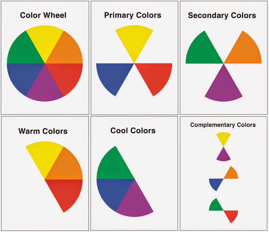
If you remember, these are the colours opposite one another on the colour wheel: red and green, blue and orange, yellow and purple. The colour wheel has been around since 1666. It was invented by Sir Isaac Newton and used by Claude Monet. Ever since then we've trusted that these pairings are pleasing on the eye.

Image source - http://crobbesart.blogspot.com/2015/03/warm-and-cool-colours.html
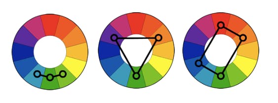
More modern depictions of the colour wheel show twelve colours, which make up the RYB (Red-Yellow-Blue) colour chart. For web design, you can pick three colours that sit next to each other on the wheel because they'll always hang nicely together. Or draw the corners of a triangle, rectangle, or square shape evenly within the wheel; the corners pinpoint the selection of colours. These will always work well together because they're part of the same tried-and-tested RYB chart.

Number 2
Keep colours consistent for a dramatic increase in conversions.
Research by the University of Loyola in Maryland suggests that sticking to the same palette of colours on your website can increase brand recognition by up to 80%.
If you don't want to mix colours, add black, white or grey to just one colour to create a different hue:
- Make a colour lighter by adding white (tint)
- Make it darker by adding black (shade)
- Change the intensity by adding grey (tone)
A selection of different tints, shades, and tones of your chosen colour can form a colour palette too.
Number 3
Add accents of colour to prompt people to click.
Think about the conversion elements on your website. All the thought that goes into the headline, the description, the navigation, the images, and the button placement.
Do you give the same amount of thought to the colour of these key areas? Is it clear to your viewer what they should click on next?
In the EE example below, they highlight the headline and the button with a flash of yellow.

To keep colours balanced, not garish, use this design tactic:
- Establish your brand colour by using it across most of your site (60%)
- Make the brand colour stand out more by using a contrasting colour in places (30%)
- Highlight areas key to conversion by using an accent colour sparingly (10%)
Think about the colour you use to showcase headings, navigation, buttons, and hyperlinks.
Tip! Background colour affects conversion.
Most websites have a plain background and lots of white space because it makes the text easier to read. Breaking convention with yellow text on a grey background may feel rebellious, but is it a smart move if nobody can read it? If your message is lost, your sale is lost too.
Conversion experts don't guess
Get to know what each colour means and it could give you an advantage in your optimisation strategy. Your next test could reveal something unexpected that turns a poorly performing page around.
- Colour specialist, Carlton Wagner, once claimed yellow "activates the anxiety centre of the brain". If you're a gentle brand with a peaceful product, you should test yellow against green.
- The University of Rochester suggests red makes people nervous when taking a test. If you're in the education sector, you might want to avoid red buttons on your website.
- Orange is said to be a polarising colour; people can hate it as much as they love it. It's worth testing orange with your audience before you launch.
What works for one website won't work for another. Not all women like pinks and purples and some people love brown. Test it in your niche to avoid a flop—like Heinz, who famously tried and failed to launch a green version of their tomato ketchup. Parents didn't respond well to the conflict of colour. Kids didn't like it either because they associate green with vegetables and food they don't favour.
Putting colour psychology to the test (and winning)
When VegasSlotsOnline.com changed a "Sign up here!" button from green to yellow, they saw a 175% increase in conversions. Conversion optimisation is all about human behaviour and this brand knows their customer well. Because of that they were able to test what they thought might be most successful:
"Psychological effects of colour do matter. In our case, we chose two colours, both of which produced convincing arguments for their use. Our test likely would not have been fruitful if we had used white or black buttons. Our niche’s characteristics were paramount to our colour selection."
Try out colour psychology on your own site design
Will colour psychology testing work for you? If you work in conversion, you know there's only one way to find out: Test it. Find out if choosing one colour over another changes the way people behave on your website. It might just result in more click-throughs and more sales.
Here are some tools to help get you started...
Choosing a colour
- Pinpoint a colour in your logo: colorzilla.com
- Select a colour from an image: colorcodepicker.com
Selecting colour palettes
- Play with your own colour wheel: color.adobe.com
- Choose colours by category: flatuicolorpicker.com
- Choose a colour just by playing with your mouse: color.hailpixel.com
W3C compliance
- Check your colours are accessible to all web users: checkmycolours.com
- Check the contrast ratio: webaim.org
Let us know how you get on in comments. How do you use colour psychology in conversion rate optimisation?